Time offset analysis
The goal of this analysis is to analyze whether there is an average time relation between the confirmed cases and the number of dead or recovered people. To find this relation we take the time series of dead or recovered people and calculate the Pearson Correlation with the timeline of confirmed cases.
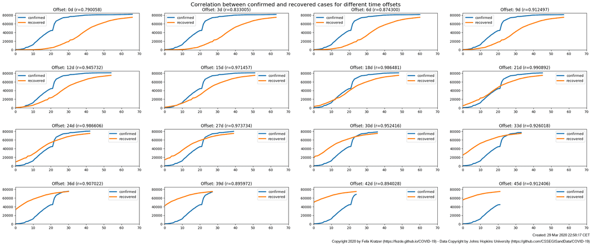
As the number of recovered (or dead) people has a time offset, we shift it relatively to the number of confirmed cases. For each offset, we calculate the respective correlations. The first chart below shows this approach for the numbers of China (as of 29th March 2020). Each sub-chart shows the according timelines, the offset in days and the resulting correlation r.
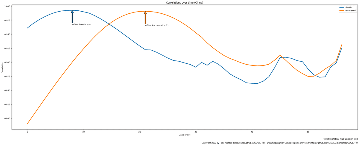
As the number of days, we offset the data, increases, the correlation between the two data sets increases. Until at a certain point (around day 21) it starts do decrease again. Mapping the correlations (both for deaths and recovered cases) against the offsets provides the following chart. It clearly shows that both correlation timelines have a maximum and that theses maxima differ from each other.
The offset resulting in the maximum correlation of a dataset it called "Offset Deaths" or "Offset Recovered".
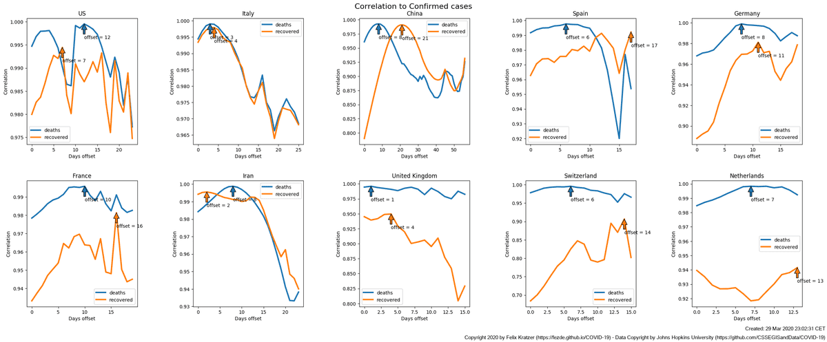
Next, we do the approach described above for several countries in the database. An example of the according timelines is shown in the chart below.
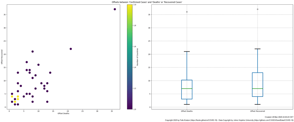
Taking the results of all countries analyzed we now can
- Map the according correlations against each other to see if there are clusters (scatter plot on the left).
- Check the distribution of both correlations to see if they differ from each other (box plot on the right-hand side).
As of writing this page (29th Mar 2020) there seems to be no clear trend. There seems to be a tendency that a recovery is defined later than a death (see box plot on the right) as the Offset Recovered is slightly higher than the Offset Deaths.
And there seems to be a bigger difference inside the offsets looking at different countries. My current line of thinking is that this is the result of different amounts of testing in the different countries and a result of the fact that we do not yet have a lot of timed data to analyze.
The current version of this chart will always be shown on the "Time Offsets" section on the main page of this project
Technical annotations
The charts of this page are created by the following scripts:


