This page aims to visualize the COVID-19 pandemy using data provided by the Johns Hopkins University.
While many pages visualize the current data on different levels, I have not yet seen any page that tries to focus on visualizing the timeline on a per-country level. This page shows the results of my visualizations.
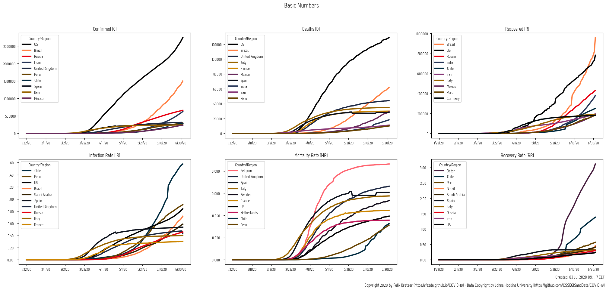
Basic Numbers
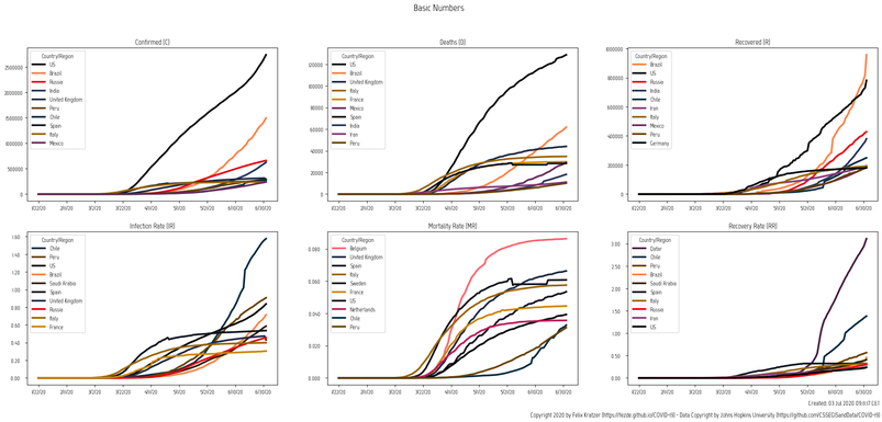
Basic Numbers
This chart aims at better understanding what the current infections mean for a certain country. While news reports (or other analyses) usually report the total number of infections per country, that does not really reflect the severness of such an infection. 80.000 infected people means something completely different for a country like China than for a country like Switzerland.
A little example:
- 80.000 infected inhabitants in China represent about 0.006% of the population while the same
- 80.000 infected inhabitants in Switzerland represent about 0.933% of their population.
Sources for these charts:

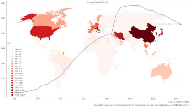
Ill People
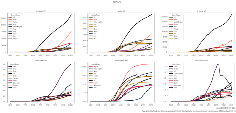
Ill People
This chart tries to shed light on the amount of people that are currently affected by COVID-19. While the first two columns show the same numbers as the chart in the "Basic Numbers" section above, the third column shows how many people are still ill with COVID-19. So it basically shows the number of CONFIRMED - DEATHS - RECOVERED.
For details see the Definitions Page

Case Survival and Case Fatality Rate
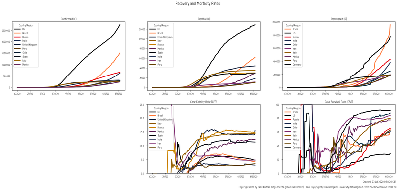
Case Survival and Case Fatality Rate
In its bottom line this chart shows two different rates:
- Case fatality rate:
CFR := D/C - Case survival rate:
CFR := R/C - For details please see the Definitions page
On the top row the absolute numbers are shown. Both rows show the countries with the highest total number in the given category.
Sources for these charts:
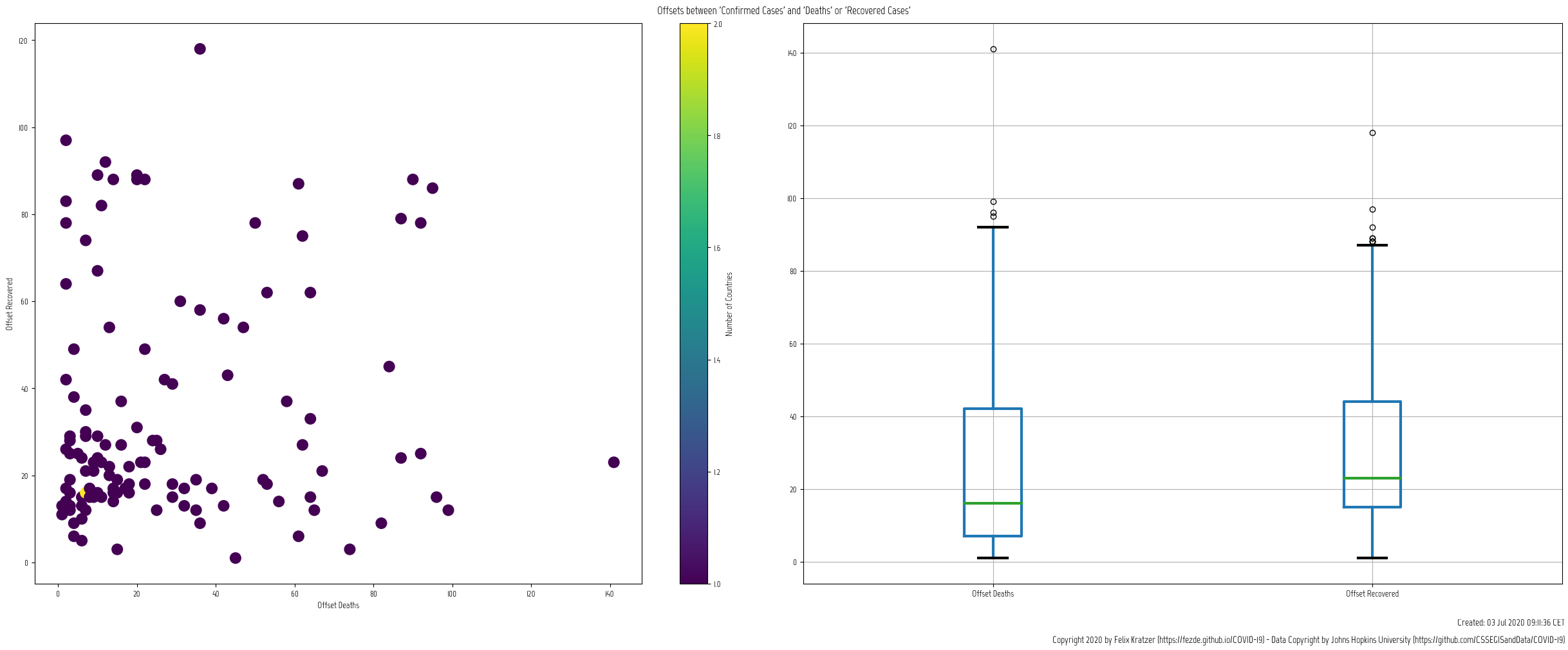
Time Offsets

Time Offsets
The goal of this analysis is to see if there is a time correlation between the confirmed cases and the deaths and recovered cases. For this a offset between the two according datasets is found that maximizes the correlation between the two timeseries.
The right-hand side chart shows the distribution for the according time offsets. So this indicates how far (in days) the recovered numbers (or deaths) are behind the reported numbers of confirmed cases.
A detailed description of this analyis can be found on this page.
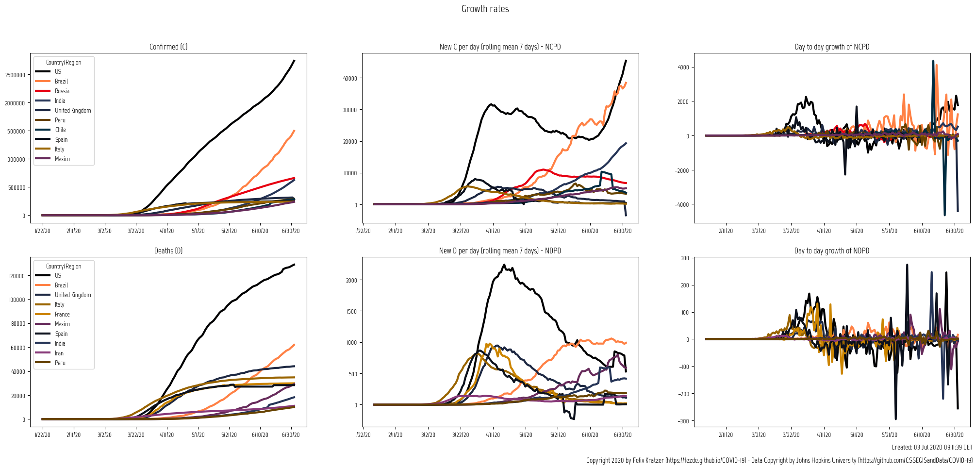
Daily Changes
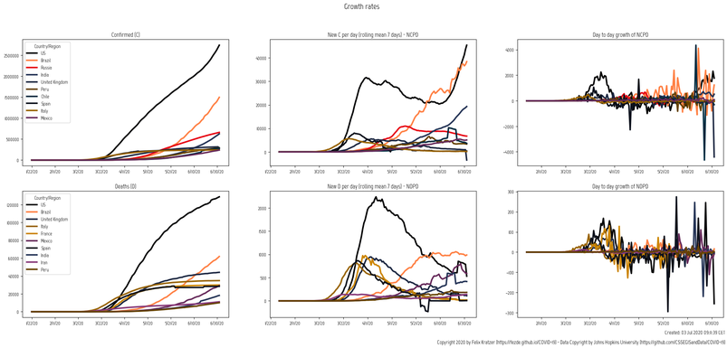
Daily Changes
This chart compares three different derivates of confirmed cases (C) and deaths (D) respectively.
The first column shows the absolute numbers over time.
The second column shows the day to day increase of the according numbers. The chart is smoothed using a rolling average over 7 days.
The last chart shows the day to day change of the second chart. So basically it shows how fast the day to day numbers increase or - more importantly - decrease. A positive value indicates that the day to day value grew in comparison to the previous day. Which means that the virus is spreading even faster than the day before. A negative value indicates that the increase rate is slowing down.

Ill People (animated)
Ill People (animated)
This animation shows the development of currently ill people worldwide.
The blue line indicates the total number. The decrease at the beginning results in the fact that mainly China was testing/reporting at that time.
The countries are colored by their according total number of infected people. The darker, the more people are infected.